Presentations have always been an effective, efficient, easily created and quickly updated tool to portray thoughts and ideas into visual presentations. Their popularity has grown immensely, not just within the education community, but also among business domain. With the growing popularity of embedding PPT's into social networking sites and blogs, many presentations domains are becoming increasingly popular. Anyone can insert their ideas into a pre-existing template or imbed a PPT into a web-based page.
However, slideshows can also be a point of concern and troublesome, even for experienced creators. The key to success is to ensure that your presentation is a visual aid for the viewers, and not a visual distraction. Slideshows are a great way to build up skills like organization of information, development of confidence, understanding logical and emotional appeals, and develop a thesis.
To add on to the art of creating amazing presentations, Edmodo Classroom lets you easily create your favorite PPT by quickly jumping into a template. But at times, it can little difficult to figure out how to construct your own unique presentation. Concepts like which images are impactful? Which backgrounds are optimal? Which fonts are best? could consume a lot of decision-making time.
In order to make the presentation creation process effective and efficient, we’ve separated out some of the common and important design tools that can help create your own masterpieces.
1. WHEN THE GOAL IS RESULTS:
There are times when you would be creating a presentation on behalf of your company or organization where you have to showcase results. For anything from general feedback, campaign learning or company financials, data is the most crucial aspect. To make report PPTs effective, you should try to avoid visuals, which can be distracting. One way is by choosing a simple and abstract background image. You can also balance this with background color scheme – using neutral tones and monochromatic as base, and brighter colors to capture audience attention on key information. Colors have always been a part of human psychology that can aid you to create eye-catching presentations.
You can also use pinpoint shapes like a triangle, which can also help focus on key points.
2. WHEN THE GOAL IS HIGHLIGHTING YOUR VISUALS:
In scenarios where there is a usage of heavy images, such as HD images, videos, newsletters, you should try and position the visuals front and center. It is recommended to use a background image with dull color, and soften colors throughout to ensure that images stick out. Although you can choose a lot of shapes to bind your images, choosing square topic shapes is highly advises as they convey a more professional feeling and also help maintain consistency with your other images.
3. WHEN THE GOAL IS TO SHARE KNOWLEDGE:
Keeping your classroom lesson engaging can be sometimes difficult, Edmodo Classroom ensures that you can find a balance between knowledge and fun. For starters, you should start with a background image which focuses on paper texture. It can help provide a neutral and subtle backdrop making audience focus on the topics.
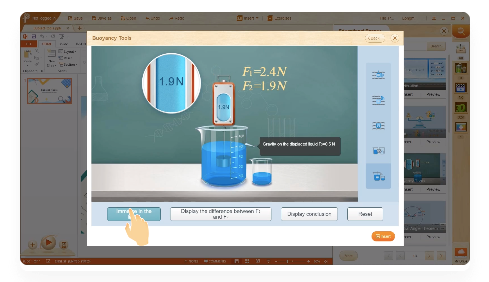
Secondly, you can make use of Interactive Subject Tools which can be drawn from real life scenarios making classrooms better realize learning concepts. These tools cover subjects like Physics, Chemistry, Maths etc. and ensure that teachers get more time to focus on other things.

4. WHEN THE GOAL IS TO SHOWCASE YOUR WORK:
Every presentation requires a lot of research and hard work, and once it’s finished, you would want your audience to appreciate your efforts. To do this, you can choose a background image that is energetic and fun. The topic shapes should be square or oval, but a thick outline can give them a more distinct look.
To add more weight t your presentation, you can use 3D Resources that can add a new dimension to your lesson preparation. With Edmodo Classroom’s abundant and wide collection of 3D resources, you can keep every class session interactive.
Using fonts, which look more hand drawn like Curlz and Apple Chancery, can end up being more distracting than helpful. You should hence focus on fonts like Arial and Avenir.
5. WHEN THE GOAL IS BEING PERSUASIVE:
In many scenarios, you might be presenting your ideas in a boardroom meeting or among your students. These situations might require you wanting to be more persuasive than usual and requires your PPT to be credible, informative and clear. For such moments, consider using a cityscape background image. These types of images showcase development, growth and improvement. The topic shapes should be round i.e. oval or circles.
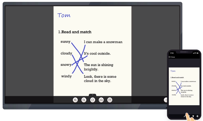
To add more weight to your debate, it would be really great to control your entire presentation with a Mobile Remote control. By accessing your PPT with a touch of your mobile, your audience would feel that you have a certain amount of confidence in your work.

Now that we can assume that making a compact and powerful presentation isn’t an easy task, but tools like Edmodo Classroom can certainly help you reduce that stress. We hope that the above list of how to focus on various aspects of slideshows will help you to know what to focus on, and then divide into manageable chunks. If you have more such steps or shortcuts that you explore while trying out Edmodo Classroom, do let us know with your feedback.

